
Thursday, 6 August 2015
I think the advertisement has used the following features to make their ad stand out. They have used big fonts, drawing the readers eye to look at it and want to buy the product they are selling. I also think the colours they have used. The picture of the product is the biggest thing on the page and it will immediately draw the audiences eye. I think this advertisement is a good ad for those who like to eat.


Wednesday, 5 August 2015

The Fun Breakfast
I think the advertisers have used the following features to make their ad stand out:
1. I chose this because it looks colourful and it caught my eye. I think the advertiser has used these colours well to get people's attention.
2. The little person in the picture makes it look like the Lucky Charms could be fun to eat. This might make kids want to have some.

2. The little person in the picture makes it look like the Lucky Charms could be fun to eat. This might make kids want to have some.

Lucky Charms
I think that the advertisers have used the following features to make their ad stand out:
1. They used large fonts for the name of the product. This is effective because it makes it easy to read what they are selling.
2. They have used mainly rainbow colours. This makes the reader want to look at the ad and find out more about it.

2. They have used mainly rainbow colours. This makes the reader want to look at the ad and find out more about it.

The Shrek Twinkies
I think the advertisers have used the following features to make their ad stand out :

1. The font because it is big and chunky.
2.They also use colours by using mainly greens and light red. This makes it easy to look at.
3 They have put the logo on this product because they want people know they made this product.
I think that the advertisers have done better because the Twinkie colour doesn't look very appealing.
I think that the advertisers have done better because the Twinkie colour doesn't look very appealing.

I think the advertisers have used the following features to make their ad stand out:

1: Font because it has big writing and you can read it.
2: Colour because it draws people's attention to it.
3: Contrast because the main picture is dark in colour but the background is lighter. This makes the main picture stand out.
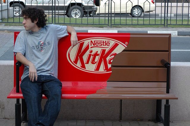
Jett's Advertisement
I think the advertisers have used the following features to make their ad stand out.
1. Font because it's big and easy to read.
2. They have also used the slogan 'Taste the rainbow', and people know that Skittles have bright colours like rainbows.
3. They have used a red against sky blue which makes the pictures stand out easily.


Subscribe to:
Posts (Atom)